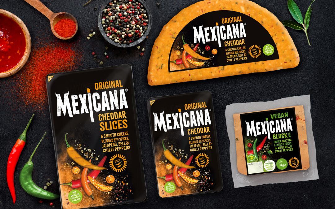
We’re thrilled to unveil the new redesigned Mexicana® cheese brand logo and packaging, set to hit the shelves this November.
The new positioning for Mexicana®, the UK’s leading spicy cheese*, is “Embrace life! Embrace spice! Embrace Mexicana®!” which communicates more versatility for the cheese with its excellent cooking and melting qualities; ‘There are those that simply survive and those that live’.
Norseland retained Madeyoulook brand design consultants for the rebrand, and is delighted with the way the agency delivered on the brief and the results.
Lisa Harrison, Senior Brand Manager from Norseland, says: “We are thrilled with the redesign of the Mexicana® packaging. We have worked with Madeyoulook for several years because they really understand the Mexicana brand and work closely with us to ensure we achieve our objectives.
“We tested each element of the design and copy with an independent research agency The Value Engineers, so we know that what we are communicating will be understood by our consumers in store, plus that we attract new consumers into the brand, whilst retaining our current loyal consumers. Plus, it is always important that the product stands out on the supermarket shelf and connects with its consumers visually.”
Brenda Moss, Managing Director from Madeyoulook says: “Our challenge was to create an evolutionary design that retained the core values of the existing brand and build in the emotional benefits of chilli spice and peppers. Previously the Mexicana® brand was perceived as endurance and was based around how much heat you can handle…Dare you try it? The new design is more upbeat and in line with the new positioning, whilst still retaining its loyal consumers of ABC1 male and female audience 25-35 that crave new tastes.”
Ed Hebblethwaite, Director from The Value Engineers says: “It was great to work with the brand team at Norseland and the design team from Madeyoulook… they had come up with a really nice idea that maintained the key equities from the original Mexicana but really moved it on with a simple but intelligent design twist. It’s not often in research you get such a clear result where new pack design is involved.”
Mexicana® has three variants, Original, Extra Hot and new Vegan, which need to work in their own right, as well as build the brand. Research confirmed that the black background was eye catching & premium with strong standout and recognition in store, this was retained and enhanced. The brand logo was adjusted and modernised. The product variety was brought forward and colour coded. The real chilli’s and sprinkling of spices added energy, life and naturalness. A chilli window was created using a single chilli so the cheese could be seen on the front as well as on the back.
The cheese is sold on the deli and in the pre pack aisle in major multiples across the UK. It comes in a range of different formats, half wheel, slices, block and minis.

